Travel Ticket Icons: A Practical Asset for Streamlined Visual Communication
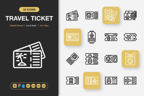
When a design project requires a clear, universally recognizable symbol for transportation, booking, or itinerary elements, the right icon set removes friction and accelerates decision-making. A well‑constructed collection like Travel Ticket Icons brings together 100 customizable glyphs in both line and solid styles, built for direct integration into websites, mobile apps, printed materials, social media graphics, and editorial layouts. Instead of spending hours drawing a ticket stub from scratch or hunting through mismatched freebies, designers and content creators can pull from a single, consistent source and maintain visual harmony across every touchpoint. This article explores how Travel Ticket Icons fits into real professional workflows, how to organize and implement the assets, and what to consider before, during, and after a project so that the icons become a reusable productivity layer rather than a one‑off resource.
Where Travel Icons Fit Into a Modern Design Process
Icons rarely exist in isolation. They appear inside navigation menus, onboarding screens, booking confirmation modals, event flyers, and infographic data points. Because ticket‑based visuals are so closely tied to actions like “book now,” “boarding pass,” or “itinerary,” a set like Travel Ticket Icons often becomes a foundational element in user interface kits, brand guidelines, and marketing templates. Before you even open a design file, the availability of a cohesive icon family influences how quickly you can wireframe a user flow or lay out a promotional banner. Without it, you might waste time searching multiple libraries, adjusting mismatched stroke weights, or explaining to a client why the confirm button uses a ticket silhouette that doesn’t match the list view icon.
Once the design phase begins, these icons interact with other resources—typography, color palettes, illustration styles, and component libraries. Because this set offers both line and solid variants, you can assign specific meanings: for example, line‑style tickets for inactive states, solid‑style tickets for active selections, or line tickets in light UI while solid tickets anchor heavier print headlines. This duality reduces the need to source supplementary icons mid‑project and keeps the visual language predictable for users.
Key Technical Features That Support Everyday Work
Understanding what’s inside a professional icon pack helps you avoid surprises later. Travel Ticket Icons includes editable stroke paths, meaning you’re not locked into a fixed line thickness. If your web interface uses a 1.5px stroke for all UI elements, you can adjust the icons to match without redrawing. The same flexibility applies to color: every icon can accept your brand palette, accent tones, or even gradient fills because they’re delivered as clean vector shapes.
The pack’s file organization anticipates real project demands. Instead of a single folder with random SVGs, you receive structured formats: an Adobe Illustrator source file for those who build design systems; a Figma file for collaborative prototyping; an IconJar file that instantly loads the set into your icon management tool; an EPS (version 10) for maximum compatibility with older software; a PDF for quick previews and print placement; and a comprehensive SVG folder alongside transparent PNGs exported at seven sizes—32px, 48px, 64px, 96px, 128px, 256px, and 512px. This multi‑format approach means a web developer can grab the SVG sprite while a print designer pulls a high‑resolution PNG for an InDesign layout. The readme file ties everything together with simple drag‑and‑drop instructions, which is especially useful when handing off assets to team members who aren’t advanced designers.
Integrating Travel Ticket Icons Into Common Workflows
How the icons enter your workflow depends on the tool stack you use. In Figma, you might import the file once and publish the set as a team library. From there, any designer creating a landing page, a booking widget, or a confirmation email can enable the library and search for “ticket,” “voucher,” or “passport” without leaving the canvas. In Illustrator, you can open the source file, select an icon, and copy it into a larger illustration or infographic, maintaining complete editability. The IconJar integration is particularly helpful for macOS users who prefer to browse icons by tag, drag them into Sketch or XD, and avoid cluttering their system folders.
Before you start a project, quickly inventory the ticket‑related concepts you’ll need: perhaps a flight ticket, train ticket, event admission, coupon, boarding pass, luggage tag, or check‑in icon. Open the Travel Ticket Icons preview or browse in IconJar and flag the most relevant ones. This small planning step prevents the scenario where you design half of a mobile app’s booking flow, only to realize you need a “transfer ticket” icon that isn’t in your free pack and that breaks your visual style. The set’s 100‑icon scope covers these edge cases generously, so you spend less time adapting and more time refining.
Practical Implementation Across Different Mediums
The real test of an icon set is how it behaves across output channels. For a website, SVGs are the clear choice. They scale without degradation, remain editable via CSS, and contribute to fast page loads. When using Travel Ticket Icons, you can inline the SVG code or reference an external sprite, changing the stroke color on hover with a single CSS variable. Because the icons support editable stroke, you won’t see odd rendering artifacts when adjusting stroke‑width in code—a common issue with badly constructed vector files.
In mobile apps, developers often require multiple resolutions for @1x, @2x, and @3x screens. The included PNG exports at 32px through 512px cover these densities directly. You can also hand off the SVG folder and let the build pipeline generate assets. For social media graphics and flyers, drag‑and‑drop PNGs at 256px or 512px into Canva, Photoshop, or Affinity Designer. The transparency ensures the icon sits cleanly on any background, whether it’s a gradient overlay for an Instagram story or a solid poster color. When used in infographics, mixing line and solid styles helps create visual hierarchy: solid tickets might mark key statistics, while line tickets guide the reader’s eye along a timeline without overpowering the data.
Books and editorial projects benefit from the PDF and EPS versions. A layout designer placing a chapter‑opening icon for travel tips can import the vector directly into InDesign, scale it to fill a column width, and apply the exact CMYK color values needed for print. Because the icons are minimalist, they don’t compete with body text or photography, which is crucial for maintaining a professional, reader‑friendly layout.
Customizing Without Losing Consistency
A common mistake when adopting a new icon set is over‑customizing individual icons to the point where they feel disconnected. With Travel Ticket Icons, the editable stroke and solid/line duality actually promote consistency if you approach customization methodically. Decide early whether your project will use rounded caps, specific corner radii, or a uniform stroke weight. Apply these settings to a master icon in Illustrator or Figma, then propagate the style across all needed instances. The source file’s layer structure makes this efficient: many icons are grouped logically, so selecting all tickets and adjusting their stroke to match your brand’s visual language takes seconds.
Color is another customization vector. If your brand uses a monochromatic palette, you can convert the solid icons to a single tint and leave the line icons as outlines. For a travel app with a vibrant personality, use the solid variations as filled shapes with gradient overlays. Since the PNGs are pre‑rendered, you might still want to recolor the vector source and re‑export if you need a particular size that isn’t included. The presence of the AI and Figma files makes this painless.
Quality Control and Long‑Term Use
Choosing an icon set is a long‑term investment. The files you place today may live inside a brand style guide or a design system for years. Travel Ticket Icons is built with that longevity in mind: the vector formats ensure no resolution limitations, and the multi‑size PNGs mean you won’t be stuck with a 64px icon when you suddenly need 256px for a presentation. Quality control starts at the point of download. Open the SVG folder in a browser or code editor and spot‑check a few files for clean markup without unnecessary inline styles or transform groups that can break when you resize them. The editable stroke claim is easy to test: open one icon in Illustrator, increase the stroke weight from 1pt to 3pt, and see if the shape remains crisp and proportional. Reliable sets pass this test.
To keep the assets organized over time, create a local master folder with the complete download. Then, in each active project folder, include only the formats and icons actually used. For example, a web project might reference an SVG sprite sheet and a few PNG fallback icons, while a print project stores the AI file and high‑res PDF. Avoid scattering loose PNGs across your drive; instead, treat the set like a design token library. If you work in a team, upload the IconJar file to a shared drive or cloud storage so everyone can browse the same collection. The readme file that ships with Travel Ticket Icons includes simple notes on installation and usage—keep it accessible for new team members so they don’t accidentally delete the link to the main source.
Using Travel Ticket Icons Before, During, and After a Project
The value of a consistent icon collection extends outside the active design hours. During the planning stage, when you’re sketching wireframes or mood boards, having the icon set at hand lets you quickly place recognizable markers that communicate intent to stakeholders without requiring them to interpret abstract boxes. A “ticket” icon placed next to a CTA button immediately signals “booking” long before the final copy is written. This speeds up review cycles and helps non‑designers visualize the flow.
During active production, the drag‑and‑drop simplicity of the PNGs and the library‑ready Figma file keep momentum high. You’re not context‑switching to stock image sites or breaking focus to recreate a simple shape. When you need to produce a quick social media promotion for a limited‑time offer, you can pull the “discount ticket” icon, pair it with copy, and have a ready‑to‑post graphic in minutes. The consistency of the set means the blog’s featured image, the email header, and the app notification all share a common visual thread.
After a project ships, the icons often find their way into documentation and future iterations. A UI kit that includes Travel Ticket Icons can be reused for a different client or an internal tool, saving you from reinventing the wheel. When you hand off design files to a developer, the organized SVG folder and clear naming conventions—implied by readme—reduce back‑and‑forth about which asset goes where. In maintenance mode, if a new feature requires a “ticket transfer” icon, you don’t have to commission or download from scratch; you check the set, and it’s likely there.
Common Scenarios and Workflow Examples
Consider a freelance marketer preparing a travel agency’s summer campaign. They need social media banners, an email series, and an updated landing page. In the morning, they open the Figma file from Travel Ticket Icons, enable the library, and rapidly build the banner layout using solid ticket icons as background pattern elements and line ticket icons inside buttons. The editable stroke lets them match the agency’s 2px UI standard. By lunch, they export PNGs at 512px for Instagram and 128px for email. The whole set, with its 100 options, covers every concept from “passport” and “boarding pass” to “meetup ticket” without needing a single custom illustration. After the campaign, they save the Figma file as a template for future travel‑related projects, reducing setup time for the next client.
An in‑house product designer at a SaaS company uses Travel Ticket Icons to revamp the event booking flow. They import the SVG set into a React component library, mapping each icon name to a component property. Because the line and solid styles share the same base shapes, they code a toggle that allows the booking UI to switch between outlined and filled states based on user interaction. The editable stroke ensures that when the design team later decides to increase stroke contrast, updating the SVG source in the master file cascades correctly without breaking alignment. The developer appreciates the clean code and well‑structured IconJar file that documents every available glyph, sparing them from having to open each SVG individually.
A small business owner who manages their own website uses Travel Ticket Icons for a membership site. They place a “membership ticket” icon on the pricing table, a “scan ticket” icon on the login reminder bar, and a “gift voucher” icon for referral incentives. Since they’re not a professional designer, the drag‑and‑drop PNGs and the readme instructions help them insert icons directly in WordPress using a block editor. The consistency across pages creates a professional impression that builds trust with visitors, all without spending on custom design.
Choosing the Right File Format for Each Task
One practical advantage of Travel Ticket Icons is that it removes the guesswork about file compatibility. For screen‑based projects, SVG is the universal champion. It’s text‑based, so version control systems like Git can track changes. For anything destined for print, EPS and PDF give you a direct path to professional offset and digital printing. PNGs serve as immediate, no‑fuss placeholders in presentations, documentation, and rapid prototyping tools. The pre‑sized PNGs also help when you need a fixed dimension for a social media template—no scaling up and causing blur. The IconJar file is particularly useful for designers who maintain a personal icon vault, as it auto‑tags and organizes the collection for swift drag‑and‑drop into Sketch, XD, or Figma.
When preparing assets for a developer, a common practice is to deliver the SVG folder and a minimal HTML preview page. The Travel Ticket Icons set makes this easy because the SVGs are individually named and typically clean. You can build a quick reference page showing all 100 icons with their names, so the developer knows exactly which ID to call. This simple cross‑functional handoff eliminates the “where is the ticket icon?” question and keeps the build moving.
Avoiding Integration Pitfalls
Even with a polished set, a few integration missteps can waste time. Avoid importing the entire PNG folder into a web project; that adds unnecessary weight. Instead, pick only the required resolutions and use SVGs wherever possible. When adjusting stroke weight, test the icon at both tiny sizes (like 16px) and large display sizes (like 200px). If the icon uses closed‑off paths, a heavier stroke might close open gaps, erasing detail. The editable stroke feature of Travel Ticket Icons typically handles this well because the paths are designed with generous spacing, but it’s worth a quick stress test. Also, if you plan to use the icons as part of a larger illustration, combine them in the same vector tool rather than layering raster PNGs, which lose editability.
For designers working across Mac and Windows, the EPS (version 10) ensures backward compatibility with older software versions that might choke on newer AI files. The PDF can serve as a middle ground—open it in any vector application, and you can extract individual icons by ungrouping. Keep a copy of the original zip file untouched so you can always return to the pristine source, especially after heavy customization or accidental deletion.
Building a Sustainable Icon Workflow
Travel Ticket Icons isn’t just a product you download once and forget; it can become part of a disciplined design practice. Treat it like a style guide: note which project uses which subset, and keep a changelog if you modify any base shapes. If you frequently use travel‑related imagery, consider creating a personal icon library that merges this set with other industry‑specific packs, using a folder naming convention like “Transport/Tickets/Boarding.” The inclusion of an IconJar file simplifies this curation because you can drag the entire set into a larger IconJar collection without manual tagging.
From an operational standpoint, having a ready‑made icon set saves measurable time during sprint planning. A product manager can estimate UI tasks more accurately knowing that the iconography is already resolved. A marketing coordinator can create event collateral faster without waiting for custom illustrations. In every scenario, the presence of a robust, editable, multi‑format collection like Travel Ticket Icons quietly elevates the quality of output while reducing the invisible labor of searching and fixing.
The set’s minimalist design language also guarantees that it won’t clash with current or future trends. Clean line and solid shapes remain timeless, whether applied to a corporate website or an indie travel blog. By investing in a versatile set now, you equip your toolkit for countless projects where a ticket, pass, or voucher needs to communicate instantly and beautifully.