Why Bug Fix Icons Are Quietly Changing How Teams Communicate About Software Issues
Every developer has been there. You're staring at a task board, a GitHub issue, or a Slack thread, and the same old generic icons stare back at you. A red circle. A gray wrench. Maybe a sad little bug emoji if the team is feeling playful. None of it really captures the difference between a critical production failure and a minor styling hiccup. This is where Bug Fix Icons step in and, honestly, make things feel a little more human.
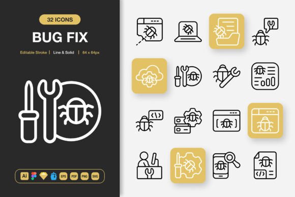
At its core, Bug Fix Icons is a comprehensive collection of carefully crafted icons built specifically around software debugging, issue tracking, and product maintenance workflows. But reducing it to just "a pack of bug icons" misses the bigger picture. It's really a visual communication toolkit that slots into project management dashboards, developer documentation, client-facing reports, and even marketing materials. The collection spans two distinct styles—line and solid—giving creatives and developers the flexibility to match the tone of whatever they're building.
When a Bug Report Needs More Than Words
Think about the last time you filed a bug report. You probably typed out steps to reproduce, expected behavior, actual behavior, and maybe attached a screenshot. Now imagine that same report with a clear, instantly recognizable icon that visually categorizes the issue before anyone reads a single word. A browser compatibility bug gets one icon. A performance regression gets another. A broken API endpoint gets something entirely different.
This is where the Bug Fix Icons collection becomes genuinely useful. The icons aren't just decorative—they serve as visual shorthand. When a product manager scans twenty new issues on a Monday morning, those icons help them triage faster. When a junior developer picks up their first ticket, the icon gives them immediate context about what kind of problem they're walking into. It's a small thing that compounds over time, especially in teams juggling multiple projects simultaneously.
Where These Icons Actually Show Up in the Real World
It's easy to assume an icon set like this lives exclusively inside Jira or Linear. The reality is much broader. Let's walk through a handful of scenarios where Bug Fix Icons find unexpected homes.
Developer Portfolios and Personal Websites
Freelance developers and agency owners often struggle to visually communicate the maintenance and debugging side of their services. Design work gets the flashy mockups. Development gets the clean code screenshots. But what about ongoing support? Using these icons, a freelancer can build a "Maintenance & Bug Fix" section on their portfolio that actually looks polished and intentional rather than an afterthought.
Client Decks and Status Reports
Agencies sending weekly updates to clients face a familiar challenge: how do you explain that progress was slower this week because of unexpected technical debt without sounding defensive? A well-designed slide using bug category icons can visually separate "planned feature work" from "unplanned issue resolution." Clients get it immediately. The icons do the explaining so the project manager doesn't have to write a paragraph justifying every delay.
Internal Wikis and Onboarding Documentation
Companies with internal knowledge bases often document common bugs and their fixes. A searchable wiki page tagged with these icons helps new hires quickly scan for relevant issues. Instead of reading through walls of text, they spot the database error icon, the authentication failure icon, or the UI glitch icon and jump straight to what matters for their current task.
Social Media and Community Management
Open source maintainers posting about known issues on Twitter or Discord benefit enormously from visual consistency. When users see the same recognizable bug category icons across GitHub, social posts, and community forums, it builds trust. They know the maintainers are organized and communicative. The line style variants work especially well for social graphics, offering a clean, modern look that doesn't compete with platform UI elements.
Printed Cheat Sheets and Workshop Materials
Believe it or not, these icons translate beautifully to print. Workshop facilitators teaching debugging techniques can create handouts where each bug type gets its own icon. Attendees remember the visual association longer than text alone. The high-resolution PNG files—available up to 512px—ensure nothing looks pixelated when printed at scale.
Two Styles, Endless Possibilities
The dual-style nature of this collection—line and solid—deserves more attention than it typically gets in icon set descriptions. Line icons feel lightweight, modern, and airy. They work beautifully on dark mode interfaces, minimal landing pages, and anywhere you want the icon to complement content rather than dominate it. Solid icons carry more visual weight. They're better suited for call-to-action buttons, alert banners, and situations where the icon needs to compete with bold typography.
Having both styles in a single collection means you're not making a permanent design commitment. Your SaaS dashboard might use solid icons in the notification bell but line icons in the sidebar navigation. A bug tracking mobile app could switch between the two based on user preferences or accessibility settings. The editable stroke feature in the source files means you can tweak line weights to perfectly match your brand's existing iconography system, which is a detail professional designers will appreciate deeply.
Who Benefits Most From This Collection
While technically anyone can use Bug Fix Icons, certain groups will find it unusually valuable. Let's look at the overlap between different roles and their specific needs.
UI/UX designers working on developer tools, project management software, or QA platforms get an entire icon vocabulary ready to drop into their Figma files. No more cobbling together mismatched icons from five different free sets. The consistency across the entire collection means the error state icon, the resolved state icon, and the in-progress state icon all feel like they belong to the same family.
Technical writers documenting APIs, SDKs, or developer workflows often struggle to find appropriate visual elements that don't look cartoonish or overly corporate. These icons hit a sweet spot—they're professional without being sterile, and they actually represent technical concepts accurately rather than vaguely gesturing at them.
Startup founders wearing multiple hats frequently need to produce landing pages, investor updates, and product mockups without a dedicated design team. A well-organized icon set with easy drag and drop functionality lowers the barrier to creating visually coherent materials. The variety of included file formats—from Adobe Illustrator to Figma to plain SVG—means the icons work regardless of which tools the founder happens to be using that week.
The File Format Factor No One Talks About
Most icon set descriptions rattle off file formats like a grocery list. But the specific formats included with Bug Fix Icons actually tell an interesting story about compatibility and workflow integration. The Figma file means design teams can pull these directly into their existing component libraries without conversion headaches. The Iconjar file is a nice touch for Mac users who rely on that app for icon management. The Sketch file keeps legacy workflows supported. And the EPS Version 10 file ensures compatibility with older print production pipelines that some traditional agencies still run.
Then there are the PNG transparency files at multiple sizes: 32px, 48px, 64px, 96px, 128px, 256px, and 512px. This isn't just about having options. It's about not needing to resize icons yourself, which can introduce artifacts or inconsistent scaling. Need a tiny status indicator for a table row? Grab the 32px version. Need a hero image for a documentation page header? The 512px PNG has you covered. The SVG file, of course, handles everything in between since it scales infinitely.
The inclusion of a Readme.txt file might seem minor, but it signals that the creator thought about onboarding. Anyone who's downloaded a massive icon set and then spent ten minutes figuring out the file structure knows the quiet value of a straightforward readme.
Customizability Without the Overwhelm
One of the more honest phrases in the feature list is 100% customizable. This doesn't just mean "you can change the color"—that's table stakes for any vector icon set. It means the source files are structured in a way that invites modification. Change the stroke width. Adjust corner radiuses. Combine elements from different icons to create something entirely new. The editable stroke feature specifically means you're not locked into the designer's original line weight decisions.
For teams with strict brand guidelines, this level of control is non-negotiable. A bug icon that's slightly too thick or too thin relative to the rest of the interface creates subtle visual friction that users feel even if they can't articulate why. Having the source files eliminates that tension entirely.
What These Icons Won't Do
It's worth being clear about limitations, because no creative resource solves every problem. Bug Fix Icons won't replace a comprehensive design system. It won't automatically make your bug tracker more usable. And it won't magically help your team write better bug reports. What it will do is give you a consistent visual language for technical communication, which is a genuine productivity multiplier when used thoughtfully.
The collection also assumes a certain level of comfort with design tools. While drag-and-drop functionality lowers the barrier, teams that have never worked with vector files might need a brief orientation period. That said, the SVG and PNG formats work everywhere—from Google Slides to WordPress to custom React components—so non-designers can still get plenty of mileage without ever opening Illustrator or Figma.
Choosing the Right Icon for the Right Context
A practical consideration that often goes unmentioned: matching icon style to medium. When you're placing these on a website, line style icons tend to feel more native, especially on light backgrounds. For mobile apps, solid style icons often work better at small sizes since they maintain visual presence even at 24px or smaller. For infographics and flyers, mixing both styles strategically can create visual hierarchy—solid icons for primary data points, line icons for secondary details.
Social media graphics benefit from slight stylistic exaggeration, which these icons support through stroke weight adjustments. Books and print materials demand high resolution and clean edges, both of which the larger PNG files and vector formats deliver reliably. Banners and posters viewed from a distance need icons with strong silhouettes, making the solid style variants the natural choice for large-format applications.
Why Visual Consistency Matters More Than You Think
There's a quiet trust that gets built when every visual element in a product or document feels like it belongs. Users might not consciously notice that all the icons share the same stroke width, corner radius, and proportional scale, but they absolutely notice when things are off. A mismatched icon set broadcasts a lack of attention to detail, whether it's on a pricing page, a bug tracking dashboard, or a printed workshop handout.
Bug Fix Icons solves this by being a single, coherent system rather than a random assortment. Every icon was designed to work with every other icon in the set. That means you can place a "bug reported" icon next to a "bug resolved" icon next to a "regression" icon, and they'll all feel like pieces of the same puzzle. For products that deal heavily with issue tracking and resolution workflows, this visual coherence isn't a luxury—it's a foundational element of user experience.
Whether you're a solo developer updating your portfolio, a product team standardizing your issue tracker, or a design agency producing client deliverables, the practical value here isn't in owning hundreds of icons. It's in having exactly the right icons, in exactly the right formats, ready to deploy across every medium where your work lives.