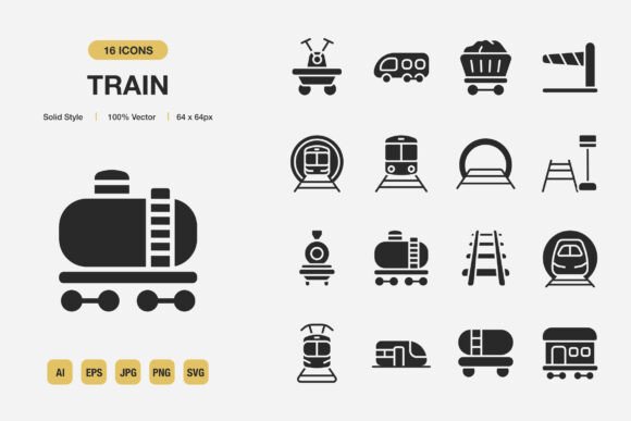
Train Solid Icons: A Practical Minimalist Design Tool for Real-World Projects
Every designer, marketer, and content creator eventually faces the same small but persistent challenge: finding visual elements that feel consistent, load fast, and don’t overwhelm the message. Train Solid Icons are built around that exact need. This set gives you 100 high‑quality, solid‑style icons that adapt to websites, mobile apps, social media graphics, printed flyers, and almost any other medium without forcing you to wrestle with mismatched line weights or complicated editing workflows.
What makes a solid icon different from an outline or duotone set is its readability. At very small sizes—like a mobile navigation bar or a cramped infographic label—solid shapes hold their ground. Thin strokes can break or blur, but a compact, filled silhouette stays crisp. The Train Solid Icons collection leans into that strength, making it a quiet workhorse for people who care about legibility and polish more than visual noise.
Where Solid Minimalism Actually Fits In
You don’t need to be a full‑time designer to use these. Think about the everyday places icons show up: a “contact” button on a portfolio site, a set of feature highlights in a sales brochure, a clever bullet‑point style in a classroom handout, or a visual cue in a mobile onboarding flow. The uniform thickness and geometric foundation of solid icons keep the interface calm. When every icon in a project follows the same optical rules, the audience pays attention to the content instead of getting distracted by clashing styles.
The solid style works especially well on backgrounds that aren’t pure white. Unlike outline icons that might vanish on a dark hero banner, solid shapes maintain contrast. This flexibility shows up again when you drop them onto product labels, book chapter dividers, social media quote cards, or event posters. Because they’re minimalist by nature, they pair easily with diverse typefaces and color palettes without competing for attention.
Real Situations, Real Users
Imagine a small business owner who needs a quick promotional flyer for a weekend sale. They aren’t going to commission custom illustrations. Instead, they open a template, drop in a few relevant solid icons—maybe a shopping bag, a percent symbol, a map pin—and suddenly the layout feels intentional rather than bare. The set’s drag and drop compatibility means those icons land straight into Canva, Figma, or even a PowerPoint slide without extra steps.
An educator building digital course materials might use the same icons as visual anchors in PDFs and presentation decks. When you’re explaining a process, a consistent set of symbols (download, upload, cloud, check, arrow) helps learners scan the page faster. Because the icons are fully customizable, the instructor can recolor them to match the school’s brand or a specific module’s palette, turning a generic resource into something that feels deliberately designed.
Web developers often keep a folder of dependable SVG icons for rapid prototyping. The SVG file format in this collection matters because it’s scalable without loss and lightweight—important for Core Web Vitals. A developer integrating a “search” or “menu” icon into a site header doesn’t want to pause and redraw a vector shape. They just grab the ready‑made file, adjust the stroke or fill color via CSS, and move on. The same SVG can be used for an app’s favicon, a PWA manifest, or inline UI elements.
Social media managers and bloggers will find the PNG transparency files especially handy. When you’re layering an icon over a photo‑based Instagram story or a colorful blog header, a transparent PNG prevents awkward white boxes. You can position the icon directly over a background image, and the edge stays clean. The JPG file option, on the other hand, works well for standard print‑ready designs where file size and compatibility with basic software matter more than transparency.
Why the Source Files Matter More Than You Think
Most icon packs include a few raster formats and call it a day. Train Solid Icons go further by delivering the Adobe Illustrator source file and an EPS version 10. For anyone sending artwork to a professional printer, EPS remains a reliable vector standard. The AI file, though, is where real customization lives. You can tweak the geometry, combine icons, or adapt the look for a brand’s specific grid system. A graphic designer working on a branding project might need to modify a gear icon so it echoes the client’s logo proportions. With an editable source file, that kind of refinement is possible without rebuilding from scratch.
Even if you never open Illustrator, the inclusion of these source files adds long‑term flexibility. Years later, if a client revises their visual identity, you aren’t stuck with outdated, uneditable shapes. The same icons can evolve with the brand, which is a quiet advantage often overlooked when people compare icon sets based on price alone.
100 Icons, Hundreds of Combinations
The number itself—100 high‑quality icons—hits a sweet spot. It’s large enough to cover most common UI actions, categories, objects, and abstract symbols, yet not so massive that browsing becomes a chore. You’ll find essentials like home, user, settings, mail, heart, star, plus more niche symbols that suit infographics, wayfinding, and niche business contexts. When you’re designing a multi‑step form or an interactive kiosk, having multiple arrow variations (left, right, refresh, rotation) within the same family makes the flow intuitive.
Combining icons into a small composition also becomes easier when they share the same solid style. A blogger creating a “how to” infographic might place a list icon next to a clock and a checkmark to illustrate a time‑management tip. Because all three icons share the same visual weight and corner radius, the graphic feels cohesive—even if the user’s design skills are basic.
Practical Considerations Before You Get Started
Solid icons, while versatile, aren’t always the right choice for every project. If your brand identity uses delicate, hand‑drawn line art, these bold shapes might clash. Consider the surrounding typography: a heavy geometric sans‑serif font next to solid icons can make a page feel dense. Introducing a little white space or using the icons at a slightly smaller scale can restore balance. Also, check the Readme.txt file that comes with the download. It usually clarifies licensing terms, attribution requirements (if any), and any tips for optimal use. For commercial projects—like a paid app, a print‑on‑demand product, or a client website—you’ll want to confirm the license covers that scenario.
Color plays a bigger role than many anticipate. Solid icons can become overpowering in pure black on a bright white screen. Experiment with softer charcoal tones, brand blues, or even subtle gradients. The fact that these icons are customizable makes that easy; you’re not locked into the default color. In Adobe Illustrator or a free alternative like Inkscape, you can change fills globally across multiple icons in seconds.
How Different Professionals Weave Them Into Daily Work
A freelance email marketer might use a small set of these icons instead of custom photography in a newsletter template. A clean “calendar” icon next to event dates, a “megaphone” for announcements—these subtle touches can lift click‑through rates without ballooning the email’s file size. The PNG transparency and JPG options ensure that even basic email builders can handle the imagery.
Book layout designers sometimes need to mark sidebars, tips, or warnings in a consistent way throughout a manuscript. Placing a solid icon in the margin of a page, like an exclamation mark inside a circle or a glowing bulb, gives the reader a nonverbal cue that cuts through text. Since the icons are vector‑based, they print sharply at 300 DPI or higher, regardless of final trim size.
Mobile app designers appreciate icon sets that already respect the pixel grid. When you’re placing a tab bar icon at 24x24 dp, every sub‑pixel misalignment shows. The solid construction of these icons improves perceived sharpness on mobile screens, and the SVG file can be opened in Sketch, Figma, or XD to align properly with internal component libraries.
Minimalist Icon Design as a Long‑Term Asset
Trends shift yearly, but solid, low‑detail icons have held steady for a reason. They communicate quickly, degrade gracefully in low‑bandwidth conditions, and don’t distract from the headline or call‑to‑action. Once you’ve integrated a set like Train Solid Icons into your workflow, you’ll likely reuse them across multiple projects. That repetition builds a subtle consistency—your event flyers, your YouTube thumbnails, your internal training docs all speak a similar visual language without extra effort.
When you’re deciding whether to download, think less about the immediate project and more about the recurring need. Most creators juggle several roles: you might be a part‑time blogger, a weekend workshop host, and a full‑time marketing associate. One pack of adaptable, solid icons, with source files, raster and vector formats, and clear usage rights, becomes a cross‑functional asset — closer to a trusty tool than a disposable design element.
Ultimately, Train Solid Icons solve a real, everyday problem: making designs look finished without a steep learning curve. The combination of solid style, high quality, easy drag and drop compatibility, and multiple file outputs (AI, EPS, SVG, JPG, PNG) means you can move from idea to execution faster, whether you’re mocking up a website, preparing classroom materials, or printing a large‑format banner. The true test of any resource is how naturally it fits into the work you’re already doing. This set meets that bar by staying simple, quiet, and endlessly reusable.